What is a control chart?
We have already seen what a control chart is in an earlier short article. It helps the process owner to predict when his process is going to produce a defect.
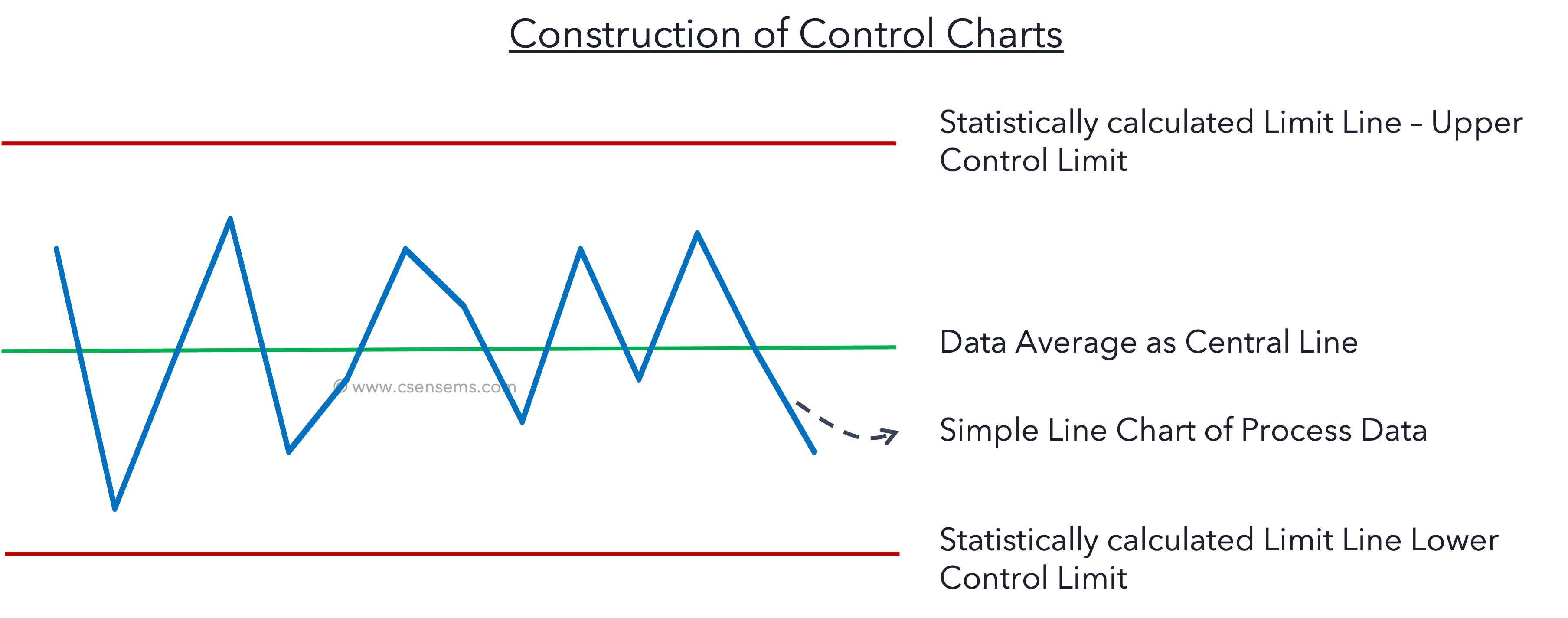
Control charts are made by drawing mean line and control lines superimposing the simple line chart of process data*. Here depending on the type of data we possess the type of control chart, and the process data will vary.
What is I-MR Chart?
I MR Chart consists of two plots namely, Individual Value Chart (I) and Moving Range Chart (MR). In this article, we will see the construction of I & MR charts and will discuss the need for MR chart in the next article on Xbar-R Chart.
Sampling Method for I-MR Chart
A simple systematic sampling method calls for I-MR Chart. In this sampling method, we take one piece of sample at a regular interval of time.
Construction of I-MR Chart
I Chart
Formula for calculating Control Limit
Central Line = Mean of all individual values of the data set
Upper Control Limit = Mean + E2 * R-bar
Lower Control Limit = Mean – E2 * R-bar
E2
E2 is a constant derived according to the control chart constant table, which is available on the internet.
R-bar
*Note : I chart & MR chart is possible only when we follow Simple Systematic Sampling. In this method, every time only one sample is taken. Meaning, the subgroup size is 1. For Subgroup size of 1, statistics does not recommend E2 value. Hence, we consider it as same as of subgroup size 2. Because, we are considering the next data point to calculate the moving range, we can consider a subgroup size of 2.
R-bar is the average of moving range.
Moving Range
What is moving range?
Moving range is the difference between two consecutive points of a data series. Consider a data series
| Data Points | Moving Range |
| 20 | |
| 28 | 2 |
| 31 | 3 |
| 29 | 2 |
| 29 | 0 |
| Average of Moving Range, R-bar | = 7/4 = 1.75 |
Absolute value of the difference between the previous point and the current point is noted as Moving Range in that row.
For moving range chart, the central line will be the Average of Moving Range. Upper and Lower control limits are calculated with the similar formula of I chart.
Central Line = Mean of moving range
Upper Control Limit = Mean of Moving Range * D4
Lower Control Limit = Mean of Moving Range * D3
Control Chart Constants

How can we create I-MR chart in Excel?
I am still not sure why Microsoft is not providing control charts yet in Excel Data Analysis. There is no direct support to draw or create control charts in excel. So, we need to calculate the Average, Upper and Lower control limits for Individual Chart and similarly for Moving Range Chart.

Attaching an excel template to minimise your burden. The formulae are visible to make it even easier to learn. It is formatted as well. Simply copy paste your data in the column indicated and select the data range for the graph. You will get I Chart and MR Chart.
